DM
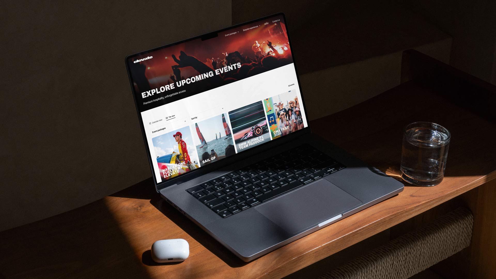
Experiences by Elevate sells premium hospitality experiences and high-value ticket packages for global sporting and entertainment events. While the products positioned the company in the luxury market, the digital experience failed to reflect the same level of quality, trust, and sophistication.
The organisation had grown quickly without dedicated design leadership, resulting in fragmented interfaces, inconsistent user journeys, duplicated components, and increasing design debt across the platform.
To address this, I led the creation of a scalable design system focused on improving consistency, increasing delivery speed, reducing design debt, and aligning the product experience with the premium nature of the brand.
The challenge
Despite offering luxury products at premium price points, the platform experience felt inconsistent and operational rather than aspirational.
KEY ISSUES


Established Core Foundations
Created foundational design tokens and rules for:Typography
Colour
Spacing
Grid systems
Elevation & shadows
Iconography
Responsive behaviourThis ensured consistency across all future experiences.

2. Built a Reusable Component Library
Designed reusable components with multiple states and clear usage guidelines.Components IncludedButtonsNavigation systemsCardsInputs & formsFiltersModalsTablesTicket/package layoutsContent blocksStatus indicatorsEach component was designed for:ScalabilityAccessibilityResponsive behaviourEngineering efficiency

3. Introduced Premium UX Principles
The system intentionally shifted the product experience from “functional booking platform” to “premium hospitality experience.”UX PrinciplesIncreased whitespace for luxury feelStronger typography hierarchyReduced cognitive loadClearer purchase flowsMore refined interaction patternsConsistent motion and feedback states
4. Improved Design ↔ Engineering Collaboration
A major goal was reducing friction between teams.ImprovementsShared naming conventionsClear component documentationStandardised behaviours and statesReduced ambiguity in handoffFaster implementation cycles
Established Core Foundations
Product ImpactMore cohesive and premium digital experienceIncreased visual consistency across journeysReduced UI fragmentationTeam ImpactFaster design iterationReduced duplicated workEasier onboarding for new team membersMore scalable product development process
Long-Term ValueThe design system transformed design from reactive production work into a scalable product capability.Rather than solving isolated UI issues, the system created operational consistency and established a stronger foundation for future growth.Key LearningsDesign systems are organisational tools, not just UI kitsThe biggest challenge was aligning teams around shared standards and workflows.Consistency builds trustFor luxury products especially, visual inconsistency directly impacts perceived value.Scalability requires governanceCreating components is easy; maintaining adoption and quality over time is the real challenge.Premium UX is about restraintThe most effective improvements came from simplification, clarity, spacing, and consistency rather than adding visual complexity.
